Agent Elvis

6.5
TV Show
TLDR
How the heck did they make Elvis seem totally unfunny?
What it's about
The take
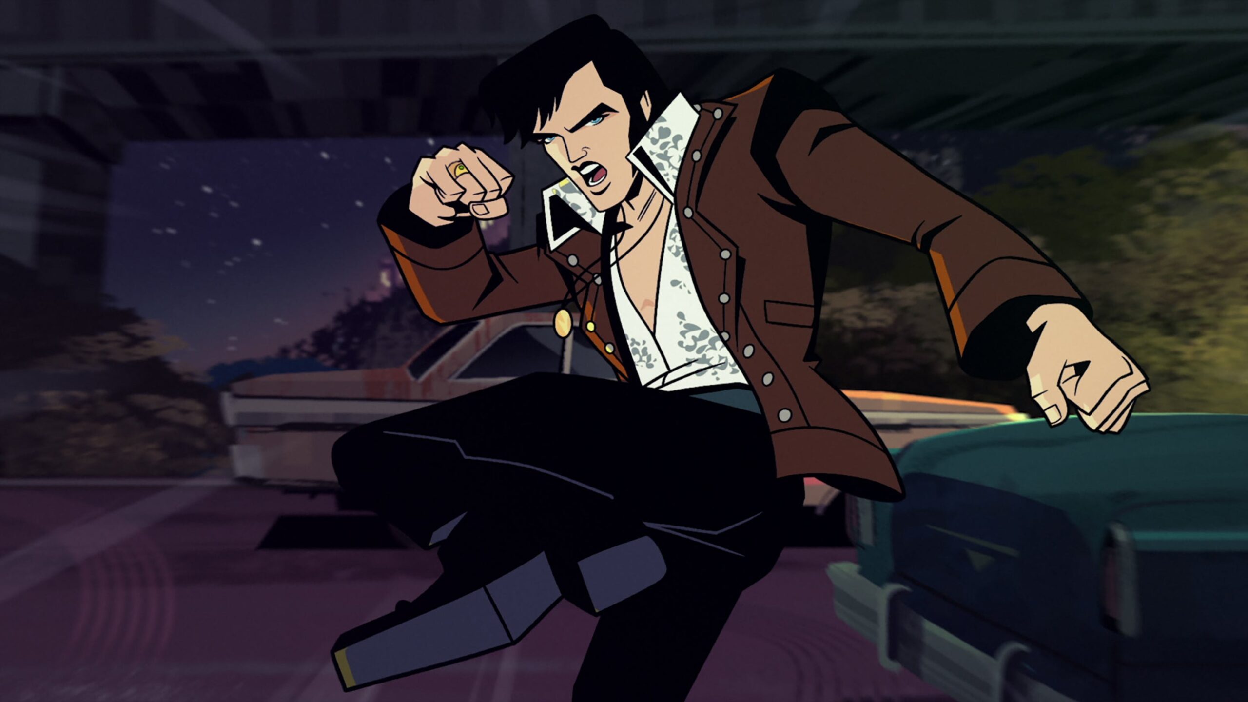
Agent Elvis is the latest reimagining of the King, this time as a cool and collected James Bond-esque spy in a 60s neon-lit world. The adult animation series takes fun and unserious turns, in 1960s world history and also in Elvis’ life. The show turns faulty on-stage shows into recollecting spy trauma, poor film performances into body doubles that step in during his missions, and pins known financial troubles to a cartoon monkey. It’s an interesting approach from co-creators John Eddie and ex-wife Priscilla, along with some cool animated sequences. It would have been successful in reimagining Elvis at his best, if the comedy was funny enough to match.
What stands out
While the comedy is a letdown, what Agent Elvis does supremely well is the animation. From Sony Animation and Vancouver animation studio Titmouse, the art style of Agent Elvis recalls old comic panel action and Robert Valley-inspired geometric character designs, and it makes the series’ action looks so damn cool. Thick-lined noir shadows meet 1960s neon in this show, and the style is paired with creative transitions and action lines that make each sequence look so watchable. It’s honestly a shame that the plot and dialogue doesn’t seem to match.
Comments
Your comment
UP NEXT
UP NEXT
UP NEXT
Curated by humans, not algorithms.

© 2025 agoodmovietowatch, all rights reserved.


